
Net Rating Life Cycles
Using net rating history to map the typical life cycle of an NBA franchise

I’ve been thinking a lot about NBA team life cycles lately. A few weeks ago, I wrote about how you definitely want to be young and good, probably want to be old and good, and probably wouldn’t mind being young and bad — but you definitely don’t want to be old and bad.
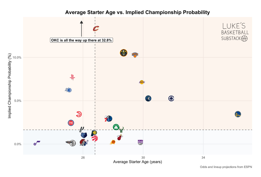
The chart above shows where various starting lineups fit on that spectrum. But that’s just a snapshot. Every NBA franchise moves through periods of growth, stability, and decline. Some cycles last a few years, others stretch across a decade or more. My assumption is that the general pattern tends to repeat.
Net Rating by Season — All 30 Teams
To get a clearer sense of what this looks like over time, I plotted each team’s Net Rating (point differential per 100 possessions) for every season since 1996–97.
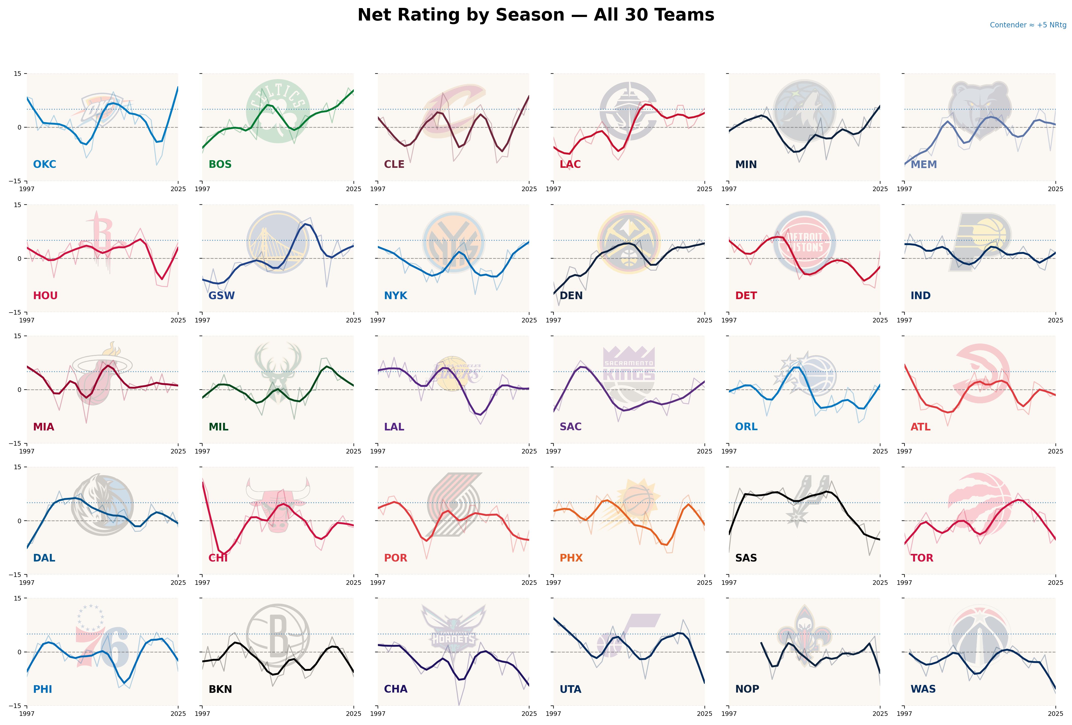
Each panel shows a single franchise’s net rating history from 1997 through 2025. To emphasize long-term trends rather than year-to-year volatility, I applied a locally weighted smoothing function to each team’s data (this helps capture the general shape of each franchise’s trajectory without letting individual outlier seasons dominate the line).
Several patterns stand out. San Antonio’s long, sustained peak that fades slowly is representative of the organization’s consistent success. Cleveland and Miami display multiple shorter cycles of success, consistent with retooling rather than rebuilding (i.e., consistent with having LeBron James and then not having LeBron James). A handful of teams, including Charlotte and Washington, have rarely reached sustained positive stretches. The differences in the frequency and magnitude of these peaks likely reflect a mix of organizational approach, luck, and broader historical context.
Aligning Curves by Peak
Because every team’s rise and fall occur on a different timeline, the individual charts can be hard to compare directly. To look for a shared pattern, I re-centered each franchise’s history around the season in which it recorded its peak net rating. The chart below shows the median curve across all teams, spanning the ten seasons before and after each franchise’s peak year.
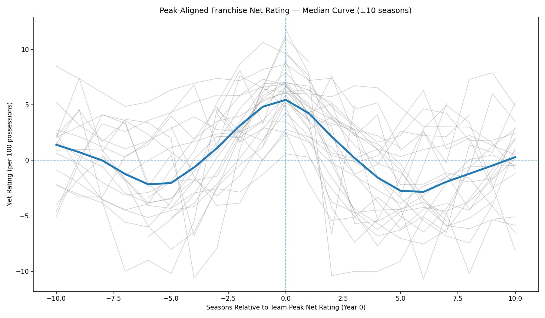
The aggregate pattern is straightforward. On average, teams take about five to six seasons to climb from below-average performance to their best year. They remain near that level for two to three seasons before entering a gradual decline lasting roughly another five to six years. The symmetry of the curve is notable: the ascent and descent occur on roughly similar timelines, though the fall often happens slightly faster.
Individual variance is wide. Some teams sustain elite play for longer, others rise and fall much more quickly. But the median curve suggests a relatively consistent life cycle across modern NBA history. Or at least one that matches my prior intuition.
Putting Teams in Buckets
I usually think about teams in 5 stages of team building:
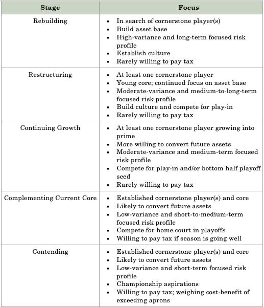
I think we could probably map these onto the median curve above:
Rebuilding and Restructuring occur during the climb on the left side (roughly below 0 net rating).
Continuing Growth marks entry into playoff contention (roughly 0-2 net rating)
Complementing the Current Core (roughly 2-4 net rating) and Contending (roughly 4+ net rating) align with the plateau and peak.
As aging, cost, or attrition set in, teams eventually return to the earlier phases and begin again. The cycle continues.
So What?
This isn’t to suggest that every team is bound to rise and fall the same way. But it does suggest at least some median path through time. Recognizing those paths and the financial and roster pressures that accompany them seems like a plausible way to understand how competitive windows form and fade.
There’s probably another obvious step here: using current performance data to estimate where a team sits on its curve and predict what might come next. It’s certainly on my list. But, for now, looking backward seemed like the right place to start.